The Red Shirts Guild
Logo Type: Abstract, Icon, Type
Genre: Sci-fi, Competitive, PvP, Space
Tags: dark mode, death, repetition, respawn, star trek, red, mission
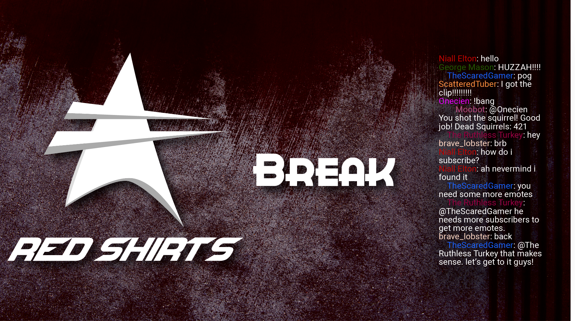
The main logo was made to be reminiscent of Star Trek, while still being different. The two spikes across represent the fatality of the job and the repetition. The text font was chosen to reflect the science fiction genre. Aspects of the peripheral designs were chosen for the Star Trek callbacks.
The Red Shirts Guild is based on the philosophy that it does not matter the deaths, only the victory. No matter how many times we die, as long as we succeed nothing else matters. Respawn was made for us.


